
Wayfinding System
Client: IKEA
Team Size: 3 Designers
Timeline: 4 Months
My Role: UX/UI Designer, User Researcher, Graphic Designer, 3D Modeler
My team and I developed a comprehensive wayfinding system for IKEA including the brand strategy, information content, graphic design and hardware systems.
Defining the Problem
Our team was provided with a blank parking lot layout and were tasked to develop and integrate an IKEA branded wayfinding system.
Constraint: A blank parking lot layout with predetermined buildings, pathways and regulatory signage.
Challenge: Designing a clear navigation system that is accessible for everyone and universally understood with bold colours and icons
Goal: Design an intuitive IKEA-branded wayfinding system with necessary signage for seamless engineer implementation.

Current Wayfinding System
Technique: One-Way Route, Maze-like Navigation
IKEA's counter-clockwise one-way route guides customers through the entire catalog, encouraging exploration and purchases.
Benefits:
Ensures a seamless shopping flow without backtracking.
Ends in the warehouse and cashier area, followed by a food court for post-shopping snacks.
Application:
Clear overhead and eye-level signage.
Pamphlets and floor stickers marking paths.
Distinct themes for each product area.

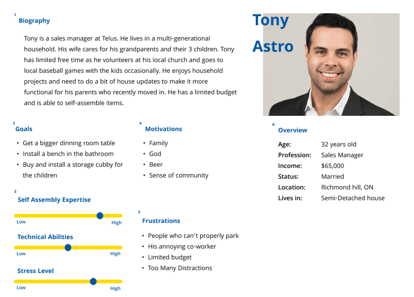
User Persona
Our target users are homeowners and renters who are:
Budget conscious, valuing quality products
Prefer simple assembly and lightweight packaging
Attracted to trendy, minimalistic furniture
Seeking time-efficient and easy-to-follow instructions
Includes families, singles, students and elders
We chose one-word and logo based nomenclature for the building names for simplicity and ease of understanding, with familiar words that are easier to remember. We selected Noto Sans for the font because it’s clear, readable from all distances, and adaptable to different language systems.
Building Naming Strategy

Blue - Warehouse
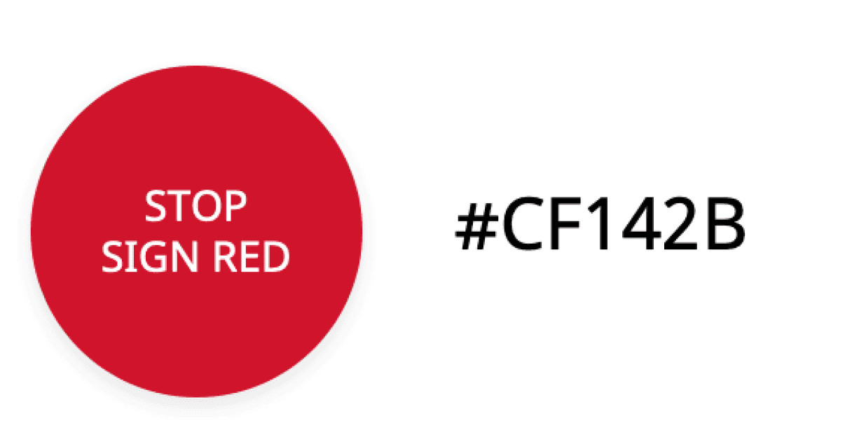
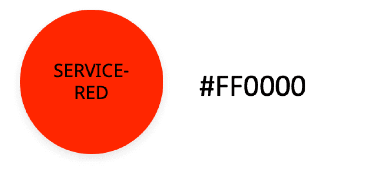
Red - Service


Yellow - North/South
Showroom
Green - Cafeteria
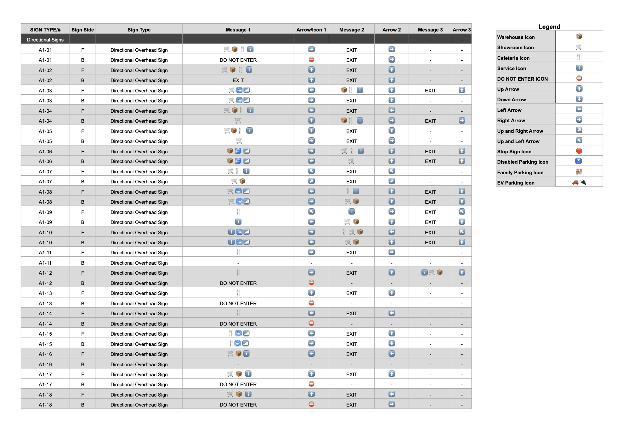
We created a message schedule system containing all the necessary signs to be implemented in the wayfinding system including:
Directional overhead signage
Building identification signage (you are here maps, column wraps, wall mounted signs and painted wall murals)
Regulatory signage (stop signs, yield signs and speed bumps)
Designated parking identification floor signage
Operational parking info signage
Message Schedule
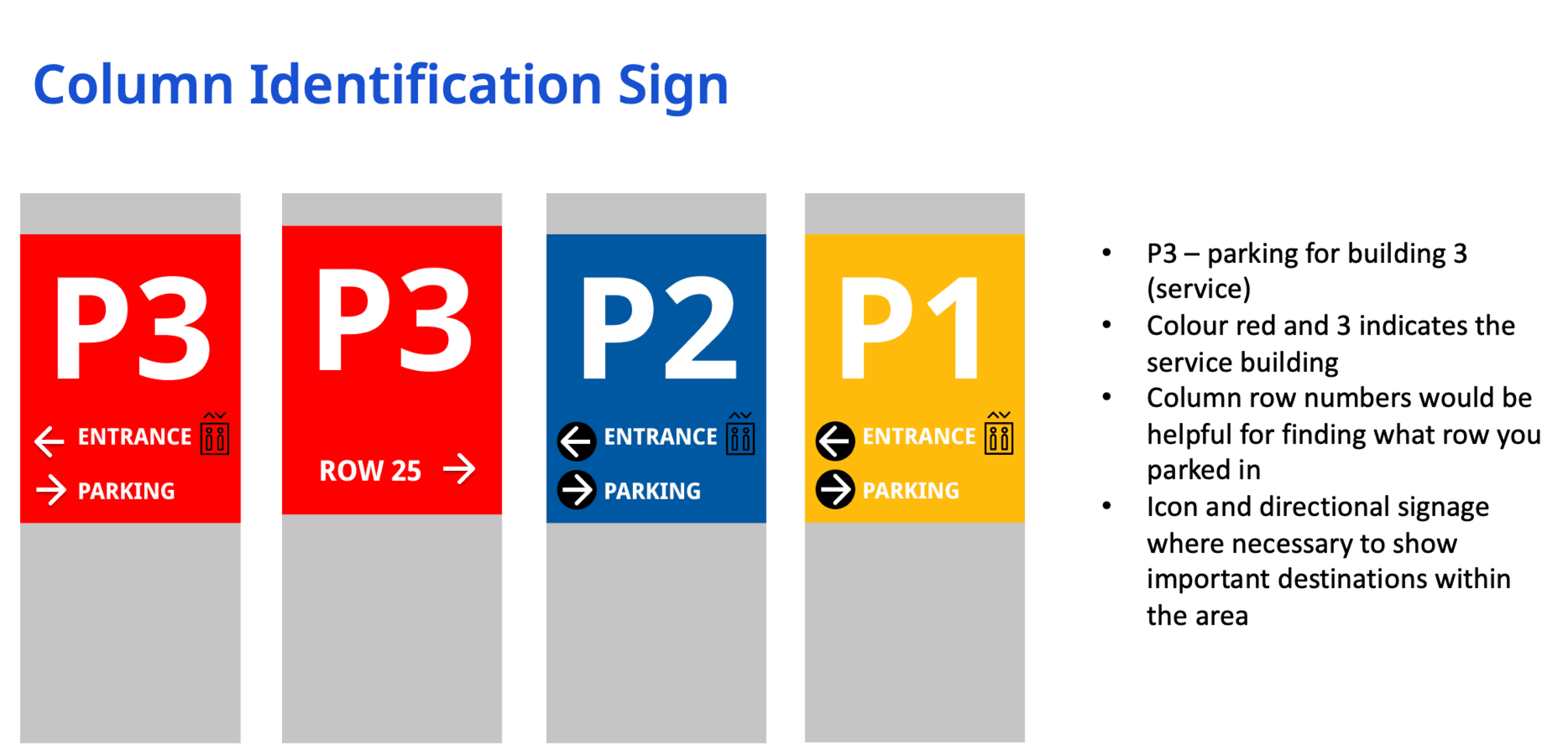
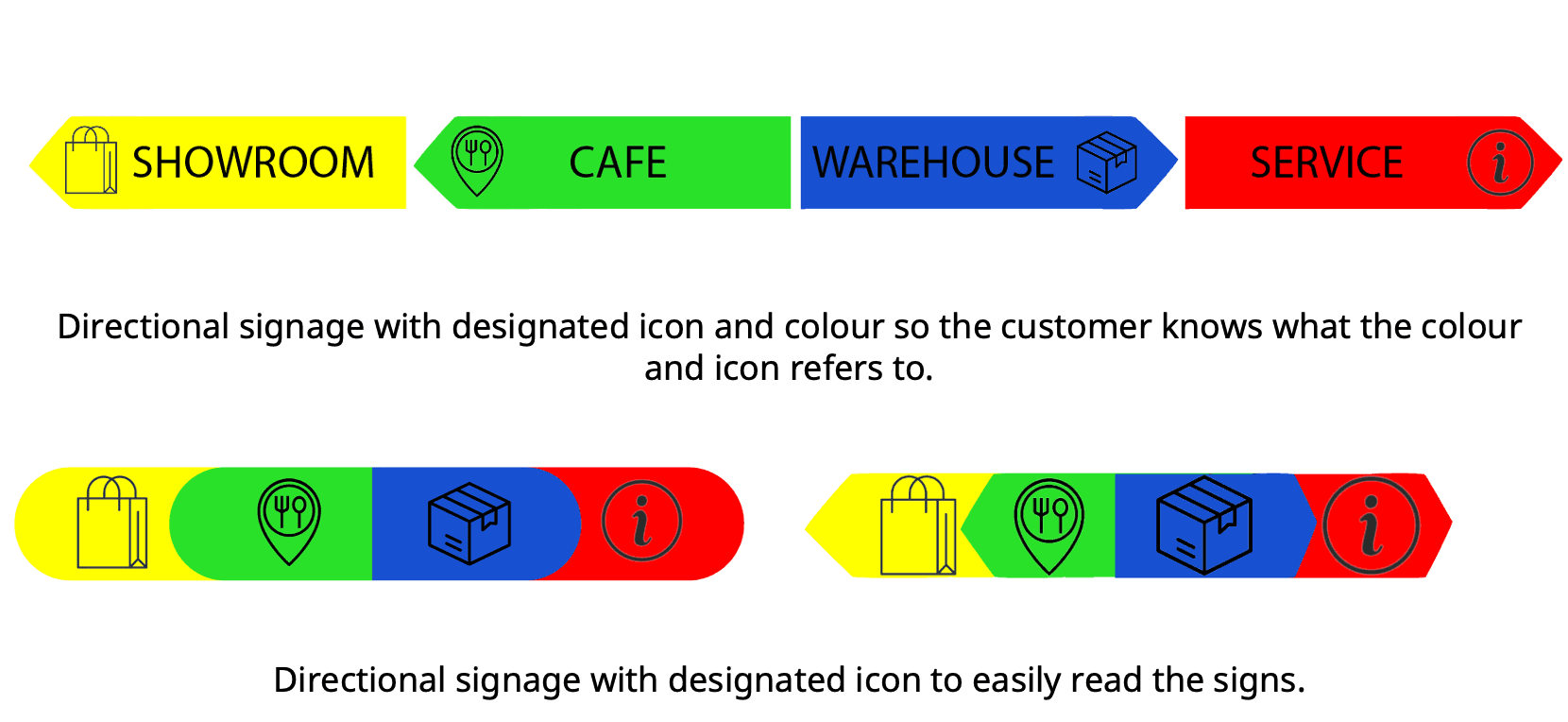
Directional Signage System
This is the nomenclature system we used for all our signage
The sign background colour directly correlates with which building area you are currently in
This allows us to implement our signs in different ways while keeping the order of information content consistent across different buildings, creating a cohesive wayfinding system


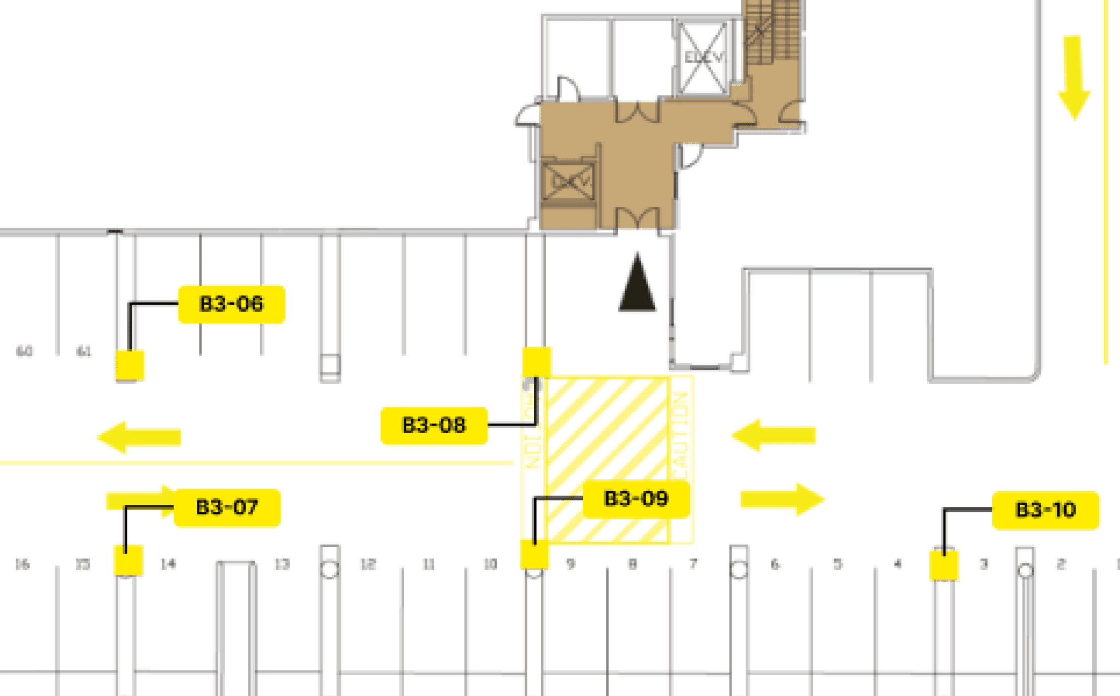
Signage Maps
We created 4 signage maps based on the most optimal locations along our 4 possible user routes.
Each map indicates all the necessary signage to be implemented and their specific location within the parking lot including:
sign number: 01
sign side: B (back)
sign type: directional overhead sign
message(s): DO NOT ENTER - EXIT
icons and arrows: 🚫 and ➡️

Colour Theory
To better understand what the user experience would look like prior to and during using the Digital Journal, we created 2 main user flows to help inform our screen designs and the overall user experience.


Assigning specific colours to each building and their respective wayfinding signage helps users easily distinguish between directional, identification, and operational signs based on their current location or destination.
Icons + Symbols
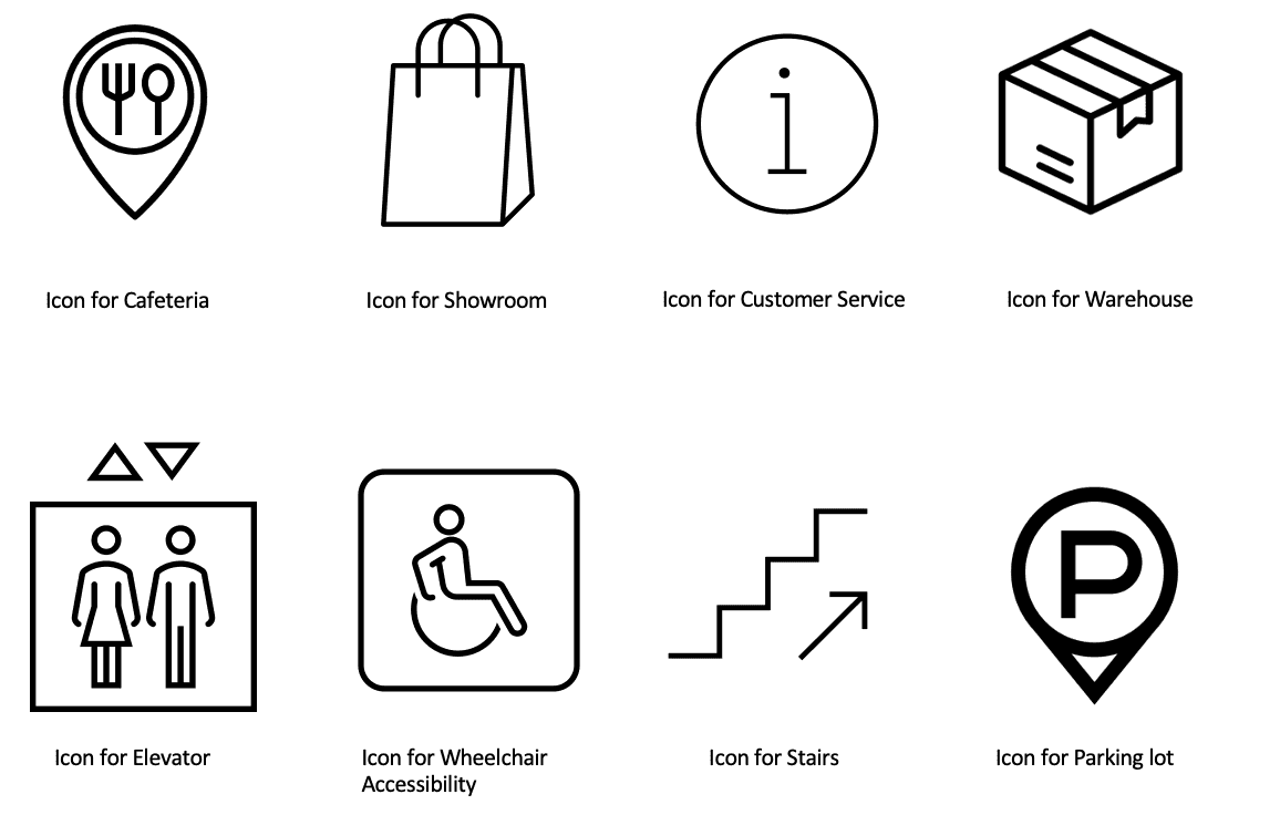
We utilized universal and accessible iconography to ensure the wayfinding system is intuitive and inclusive for customers worldwide.
Mid-Fi Signage
These mid-fi signage wireframes explore effective ways to consistently convey the customer’s current location and destination within the wayfinding system, ensuring clarity and ease of navigation at all times.
Final Sign Types
These are the final sign types exactly to scale, shown perfectly proportionate to each other. We used this to ensure all signs were accessible at all different eye levels (car, child, adult, etc).
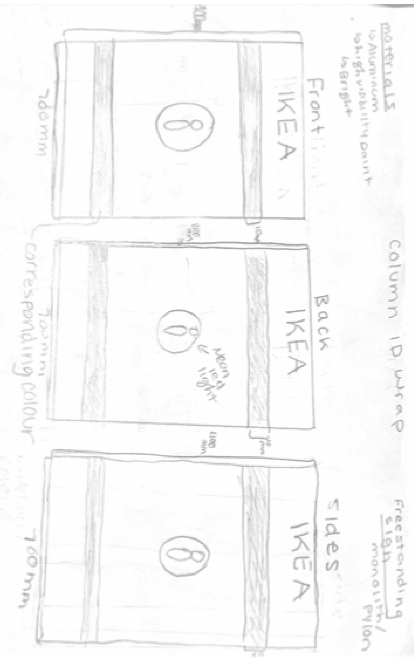
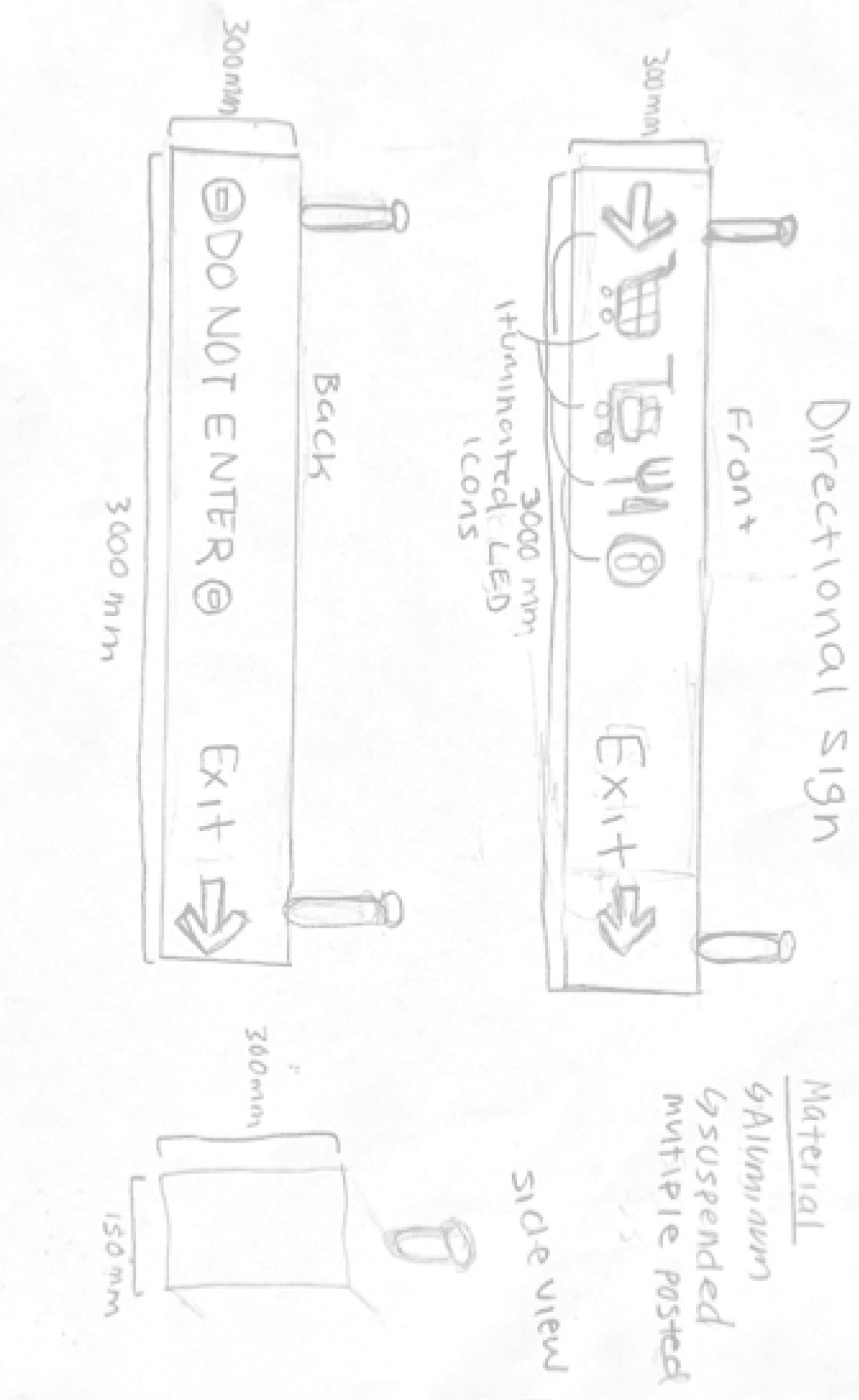
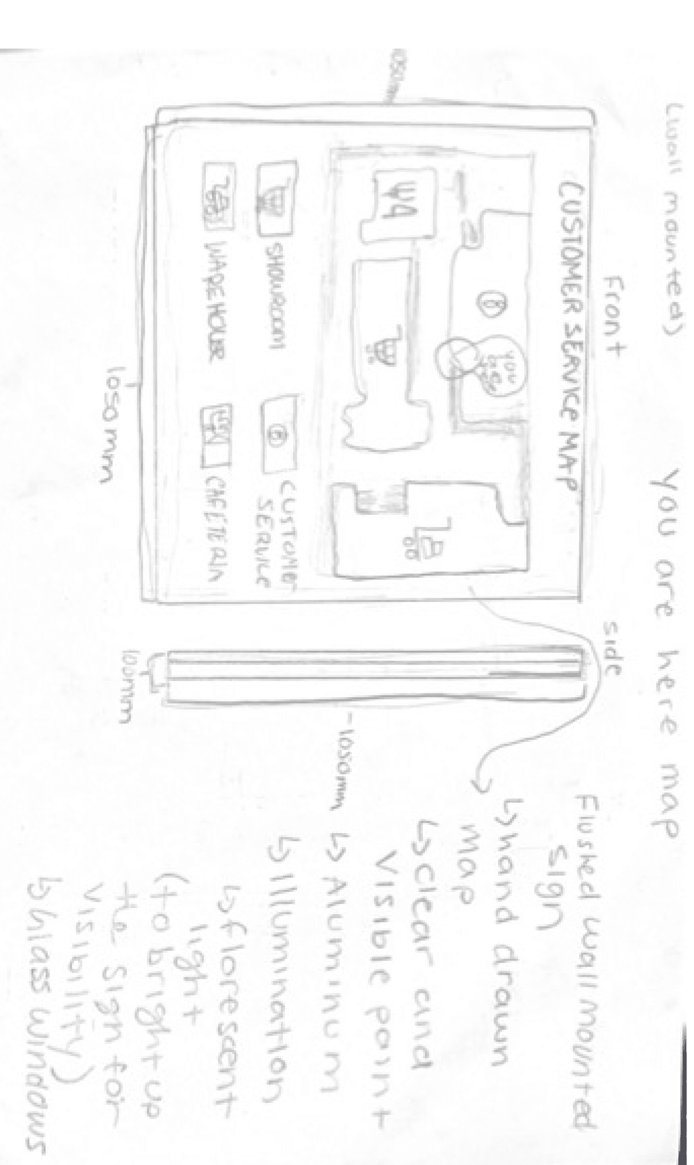
Hardware System Sketches
We created paper sketches to better understand:
How the signs were gonna look at all angles
What hardware, materials and lighting they would use
Their exact dimensions

Hardware System Strategy
Based on the sketches, we combined the graphic design system with the hardware system strategy outlining how the signs would appear from all angles in the physical environment.
This ensures system engineers and installers understand the exact implementation, including lighting, materials, and installation methods.

Hardware System Mock Ups
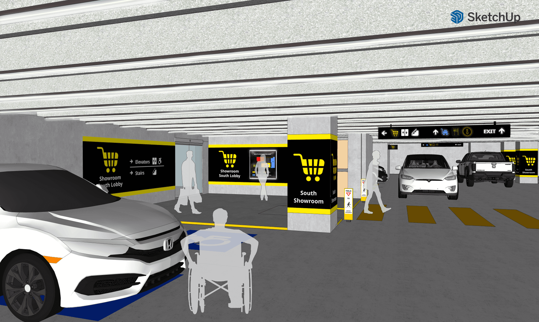
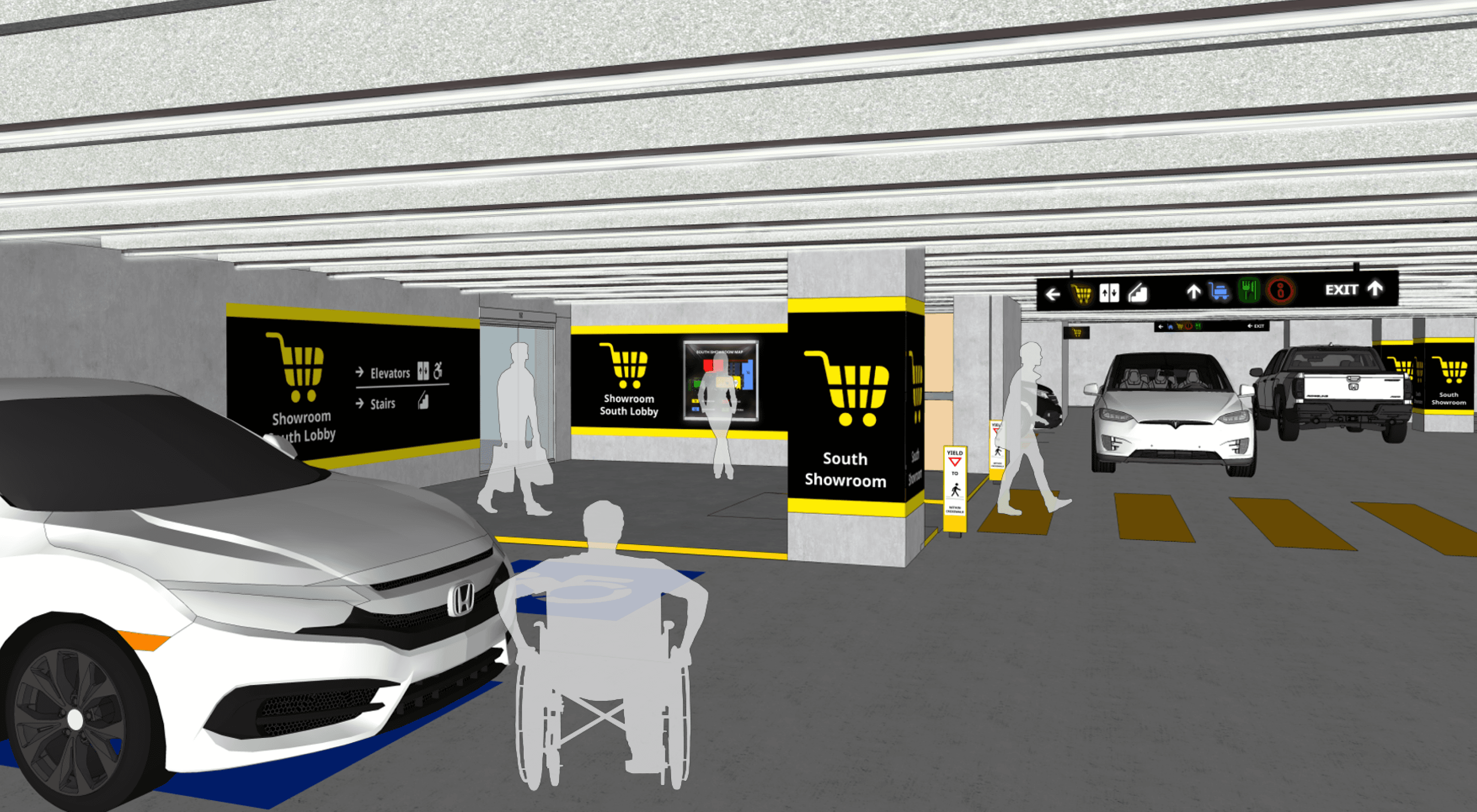
Final South Showroom Mockup
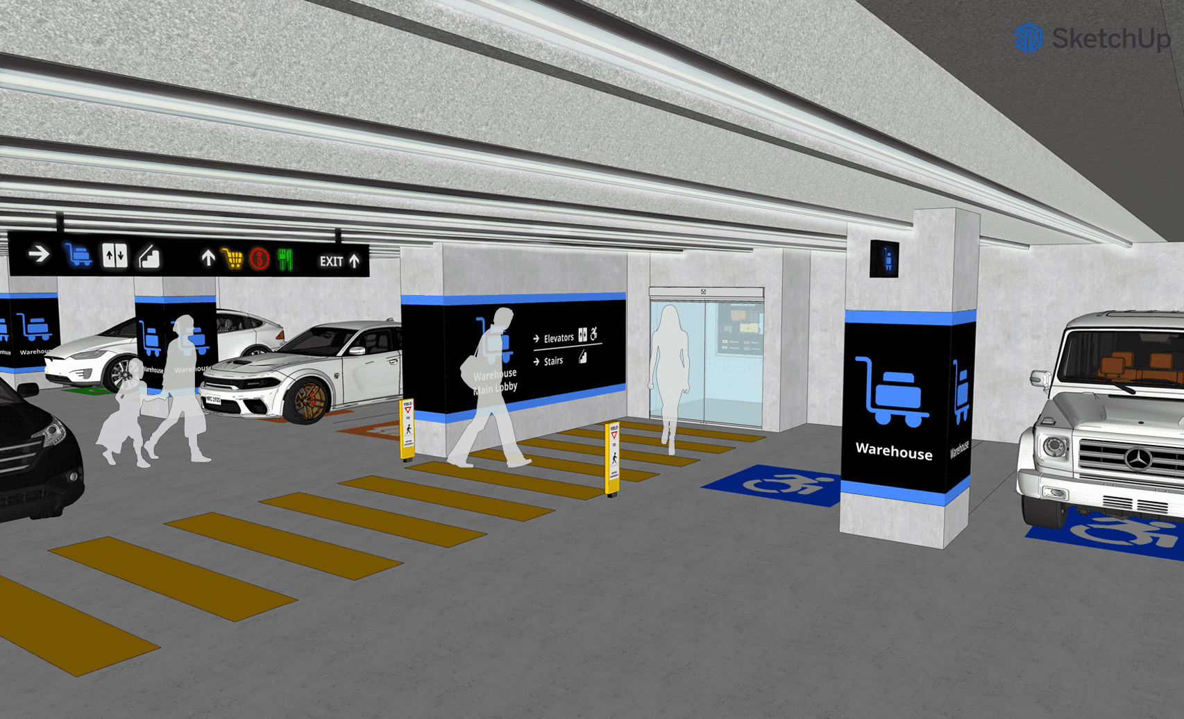
Final Warehouse Mockup
A mockup of the wayfinding system in the real environment exactly to scale.
This project sharpened my attention to detail, from precise hardware measurements to selecting durable materials that could withstand customer use.
System design is a highly iterative process, requiring multiple design revisions, and must be reevaluated over time to adapt to evolving user needs and technology.
Key Takeaways
Next Steps
Develop an app with AR-based indoor navigation to guide customers in real-time, in addition to a static wayfinding system
Gather more user generated feedback through surveys and use collected data to identify common problem areas and refine the system to enhance the user experience.
Add features like tactile signage and audio guidance for visually impaired customers.
Tools: Figma, Adobe Illustrator, SketchUp
Designed by Zy © 2025