
Mejuri - Pop Up Shop
Client: Planet Traveler Hostel
Team Size: 4 Designers
Timeline: 4 Months
Tools: Figma, Figjam
My Role: UX/UI Designer, User Researcher
My team and I developed, tested and implemented a digital journal to enhance the guest experience at the Planet Traveler Hostel in Toronto.

Defining the Problem
STAFF quote:
“Our goal is to create a sense of community”
- Robin, PT Manager
The Planet Traveler Hostel approached our team to create a digital experience/product to improve how they inform, entertain and communicate with their guests about hostel events and activities. They also wanted a fun and engaging way to increase brand awareness within the local community.
With this in mind, we came up with 3 main design challenges:
How can PT better entertain and inform their guests about activities at the hostel?
How can we remove the stigma from hostels in NA and spread awareness about the community they can provide?
What kind of experience would add to the community at PT?
Research Methodology
Our first goal was to understand the guests we are designing this digital experience for and the overall market demand by answering the following questions:
Who stays in hostels?
What do guests look for in hostels?
What are the goals of the Planet Traveler team?
How can design be used to help inform and entertain guests with hostel events and services?
To answer these research questions our team employed both qualitative and quantitative research methods including:
Qualitative Research Methods: User Surveys, User Interviews, User Flows, Persona Mapping, Service Blueprint, Client Interviews
Quantitative Research Methods: Data analysis, Awareness survey
User Surveys and Interview
Through user surveys, we gained many insights into our target audience, their needs/preferences when choosing accommodations and their overall opinions towards the hostel industry.
Using insights about our target audience, their needs/preferences when choosing accommodations and their overall opinions towards the hostel industry, we created a guest persona used to provide real world context to the target user experience.

Guest Persona
In addition to this, we performed some market research to understand what is currently needed in the market and how can we create a digital product that set will us apart from our competitors.

Web, template based design software to create Instagram posts or stories without complicated design software

A social mood board for sharing and resharing content, with moderation by board owners or Pinterest.
Users can edit photos, add descriptions, post looping DSCO videos, and easily capture and share memories, with timestamps and editing details included.
Competitive Analysis
Competitive Analysis
Our Concept: Digital Journal
A place where memories are made and are left behind, what better way to commemorate such a special time than using a digital guest journal?
Guests can share recommendations for local hidden gems, activities and events.
Digital Journal entries can help future guests in their decision making.
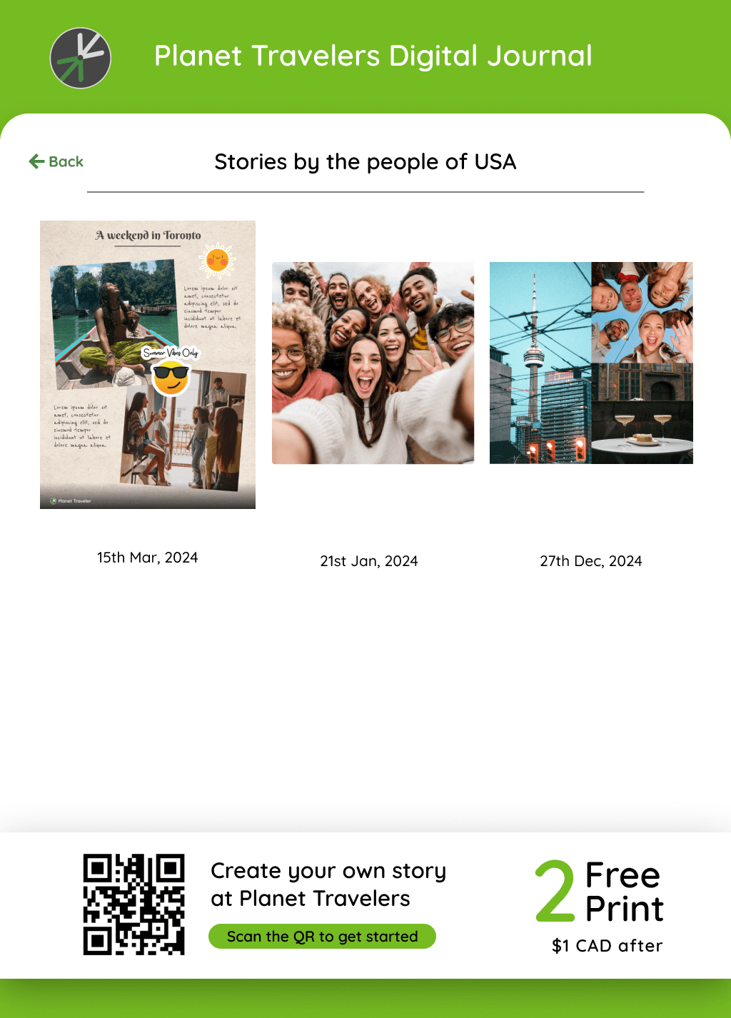
Guests get 2 free prints to take as a souvenir and leave their mark at Planet Traveler.
This data can inform future hostel activities, events and partnerships with local businesses.
Discounted stays and international/local vendor partnerships can encourage guests to use the Digital Journal.


Service Blueprint
We created a service blueprint to understand how our solution fits within the existing service, mapping stakeholders and their roles to optimize the experience. This process helped identify key opportunities to enhance the guest experience while meeting business needs:
When guests explore accommodations on the Planet Traveler website.
When guests begin their digital journey with the hotel manager, Robin, during check-in.
When guests check out and are encouraged to add to their digital journal.
After attending Planet Traveler events, when guests receive incentives to create digital journal entries.

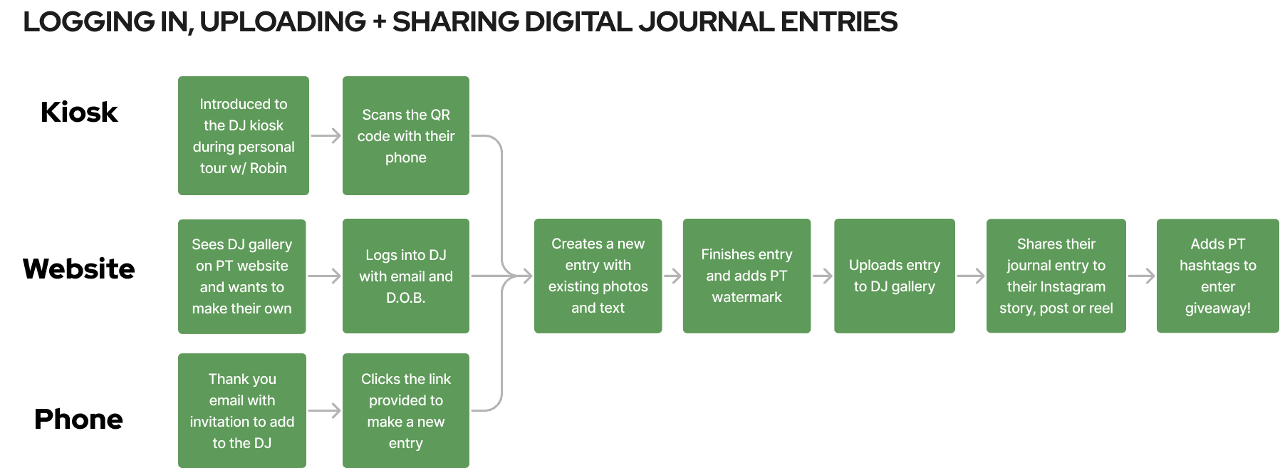
User Flows
To better understand what the user experience would look like prior to and during using the Digital Journal, we created 2 main user flows to help inform our screen designs and the overall user experience.
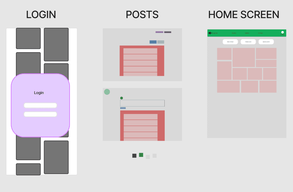
Lo-fi Sketches + Wireframes
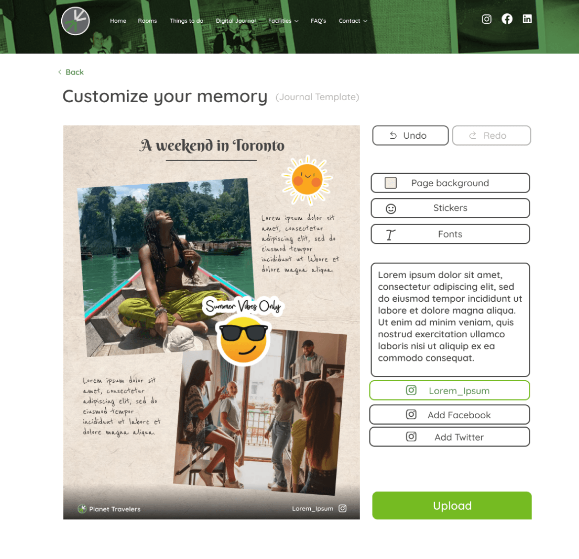
We created initial sketches and low-fidelity wireframes to visualize the user journey and digital journal experience, including customizable templates for users to personalize their journal posts.


Mid-Fi Sketches + Wireframes
During this phase of ideation, we created more mid-fi wireframes to demonstrate our concept to the client and perform user testing. We also implemented the Planet Traveler branding within the digital experience for seamless website integration.


User Testing
Using our mid-fi wire frames, we set out to test our prototypes with users, to identify possible pain points and areas for improvement.
TESTING GOALS:
Test both mobile and desktop prototypes
Measure the error rate and time on task
Use eye tracking software to identify user hotspots and areas for improvement based on how long or how much they look at certain elements (F1)
Identify gaps within the design
Develop actionable improvements based on user testing results and feedback

F1: User testing with eye tracking technology.
User Testing Feedback
DESKTOP
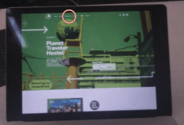
The user first focused on the top bar, missing the hidden Digital Journal on the homepage (F1).
Most errors occurred before starting an entry, with confusion caused by the smaller size of the user's projects compared to others' stories (F2).
MOBILE
Testing for the mobile went smooth, with the flows aligning well and being very clear on where to begin (F3).
However, there were no back buttons on the mobile prototype.

F1: User not knowing where to start.
F2: Most of the errors occurred when trying to start the task.


F3: Eye tracking showing the users first eye gaze.
F4: Heat mapping showing where users were looking, demonstrating all elements being centralized.
Improvements
Based on the feedback gathered from the user testing phase, we fixed the user journey pain points through implementing the corresponding design improvements into the final prototype.
Mobile Improvements:
Implemented a back button to allow for easy navigation (F1)
Desktop Improvements:
Designed a clear, captivating homepage and header for creating Digital Journal entries (F2).
Made the projects section more prominent with a start button (F2).
Centered elements based on heatmap feedback for better user engagement (F2).
F1: Added back buttons.
F2: Updated homepage header, made it clear where to begin by creating a button, made the projects section more obvious and centered all on-screen elements.


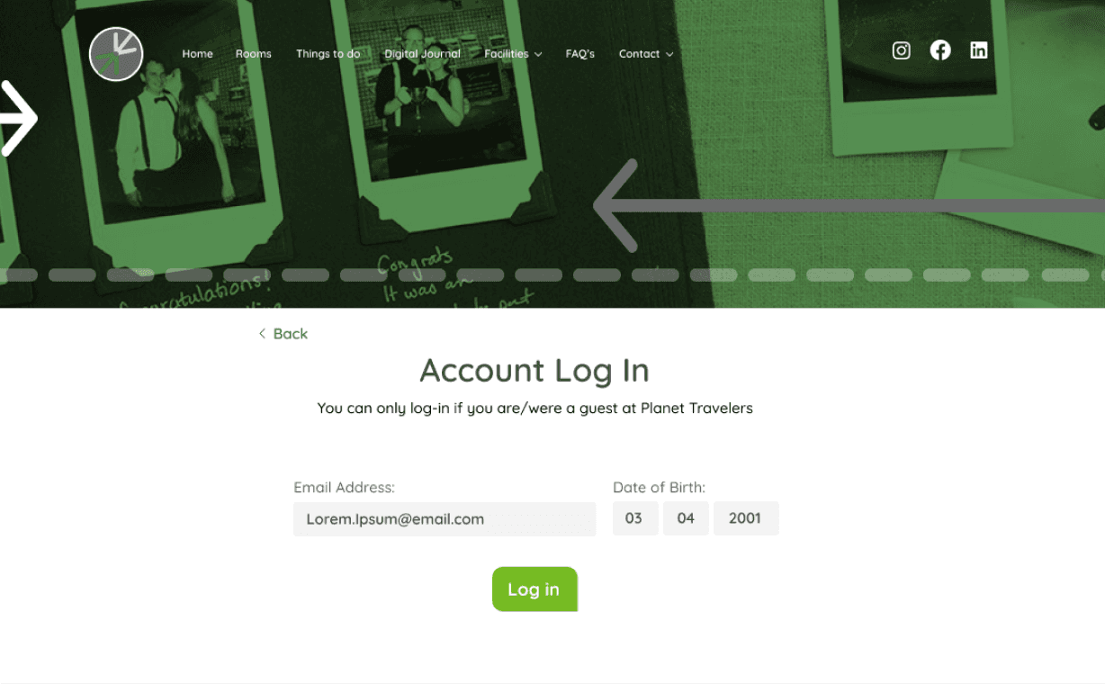
Final Prototype

HOMEPAGE
VIEWING POST AND LOG IN
STYLE AND EMPTY POST
POST AND UPLOAD


KIOSK HOMEPAGE
KIOSK GALLERY
KIOSK POST

The Digital Journal supports Planet Traveler’s core value of community.
Through personal guest experiences and stories, potential guests feel more compelled to stay with Planet Traveler because they trust other travelers opinions.
Incentive programs encourage guests to participate and share their experiences on social media, which helps planet traveler expand locally and internationally.
Implementation of the Planet Traveler watermark on physical and Digital Journal entries, serves as free marketing for Planet Traveler.
Impact
Next Steps
CLIENT FEEDBACK:
The clients loved how the Digital Journal supported their values of community building.
Added a personal touch to the guest experience and would help attract new guests and retain existing ones.
They would like us to dive deeper into how this product could help them expand and support business objectives.
FUTURE IMPROVEMENTS:
In the future, we plan to pilot this into the Planet Traveler guest experience and get feedback from guests on how we can further incentivize this feature.
We would also like co-create more closely with our target users in future additions and improvements to the product.
Designed by Zy © 2025